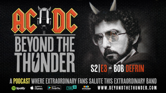
Ever wonder who’s responsible for that iconic AC/DC logo? Or for Angus Young being impaled by his own Gibson SG…or getting violently electrocuted…or sprouting devil horns and tail? Season 2, Episode 3 of AC/DC Beyond the Thunder sits down with veteran art director, Bob Defrin, the man responsible for helping one of the greatest bands of all time become one of the greatest brands of all time.
During the 70’s, Defrin became the “go-to” art director at Atlantic Records with a resume of musicians from Aretha Franklin to Eric Clapton and Foreigner. Then along came AC/DC, with a look that was more cartoon than classic. But after listening to this little known band from Australia, Defrin decided their artwork, “has to be like the music. It comes in and hits you over the head and leaves. That’s what the cover should do.”
During Episode 3, Defrin curates the stories behind every single one of his AC/DC album designs, cover to cover. Beginning with his earliest AC/DC assignment, Let There Be Rock, Defrin discusses the origins of one of the greatest, if not the greatest band symbols of all time, the gothic lettering treatment of the AC/DC logo. “I should’ve got a royalty deal on that one!” Jokes Defrin.
From the 70s golden era of AOR staples like Powerage, If You Want Blood (you’ve got it), and Highway To Hell, all the way up through the 90s with The Razors Edge and Ballbreaker, Defrin’s rapport with the Young brothers became a consistently strong relationship, communicating through sketches, photoshoots and even phone calls. “If I had a concept that I wanted to use, I would call Malcolm or Angus and I would describe it to them. They were always involved in the covers, but not sitting over your shoulder telling you what to do. You wouldn’t know that you were talking to one of the major recording artists in the world. They were just delightful to work with. I loved doing AC/DC.”
Often described as direct, simple, powerful, and even shocking, Defrin pushed the special effects envelope on live album covers like, If You Want Blood (you’ve got it) even before Photoshop. “We just drove (Angus’ guitar) all the way through his body, and it just came out the back,” laughs Defrin.
The famed designer also discusses his less-than-enthusiastic collaboration with the band during the 1980s, including their monstrous LP, Back in Black, and follow-up albums, For Those About To Rock and Flick of the Switch. At that point, the band began to take more creative control. “I would have done something different…(but) what the art director is doing is unique. You’re packaging somebody else’s talent, so you cannot let your ego get in the way of that.”
Prior to marketing today’s ubiquitous digital music downloads, Defrin’s creative mantra to live by, “A good cover is not going to help a good album. A bad cover can kill and album.” With the combination of the band’s incredible music catalog and intense artwork, it seems as though AC/DC as a band and as a brand will outlive us all.
“A good cover is not going to help a good album. A bad cover can kill an album,” says Defrin—a creative mantra to live by that transcends its origins in the era when vinyl was king. With the combination of the band’s incredible music catalog and intense artwork, it seems as though AC/DC as a band and as a brand will outlive us all.
If you want Bob, AC/DC Beyond the Thunder’s got it,
4 Responses
While I think the “If You Want Blood….” album cover is awesome, my favorite AC/DC album cover is the Albert Productions release of “Highway to Hell”. I love the flames and the guitar fretboard representing a highway on the album cover.
And, IMO, the AC/DC logo is one of the most iconic band logos ever…right up there with the KISS logo.
I agree their logo is cool, so is Van Halen’s, Judas Priest’s,Def Leppard’s and Metallica.
I always thought both VH logos were really cool, but I think the rings of fire are actually even cooler.
Band logos I am partial to (in addition to the ones listed above):
Yes / Cars / ZZ Top to name a few